Rebuilding the Child Care portal
A working prototype that reimagines New York City's Child Care benefits portal, shaped by a close audit of the live service. It turns a hard, fragmented process into one guided journey, proves a modern foundation, and is built to be tested with real families, so the decisions ahead can be made on evidence.
- 16
- test scenarios for citizens
- 7
- situations it adapts to
- 2
- design systems compared
- 1
- source of truth for the team
Background
Child Care is one of the largest costs a young family carries, and it quietly shapes bigger choices: whether to take a job, keep a job, or step back from work to look after a child. Real help exists. The city funds support through vouchers, contracted programs, and early-education seats, and most families with young children qualify for something. The quieter problem is the way in. Many families never learn the help is there, and for many who do, the path feels daunting. So the experience carries one job before all the others: meet a parent who is not sure they belong here, and walk beside them, from the first uncertain question to a finished application.
This started from a service already in people's hands. It launched quickly, under a tight deadline, on a low-code platform, with limits the team knew and accepted to make that date. Over three years more was added on that base, and the seams between the pieces began to show.
-
- Content and clarity
- Rules and consequences a family must act on were often set inside dense paragraphs, and the same idea was named differently from one page to the next.
-
- Functional gaps
- Some actions did not behave as written, and key paths like saving progress or returning to where you left off were inconsistent.
-
- Platform behavior
- Flicker, page flashes, and long waits at sensitive moments, such as just after submitting, made a stressful task feel fragile.
-
- One-size screens
- The signed-in experience showed the same content and the same calls to action wherever the applicant happened to be in their journey.
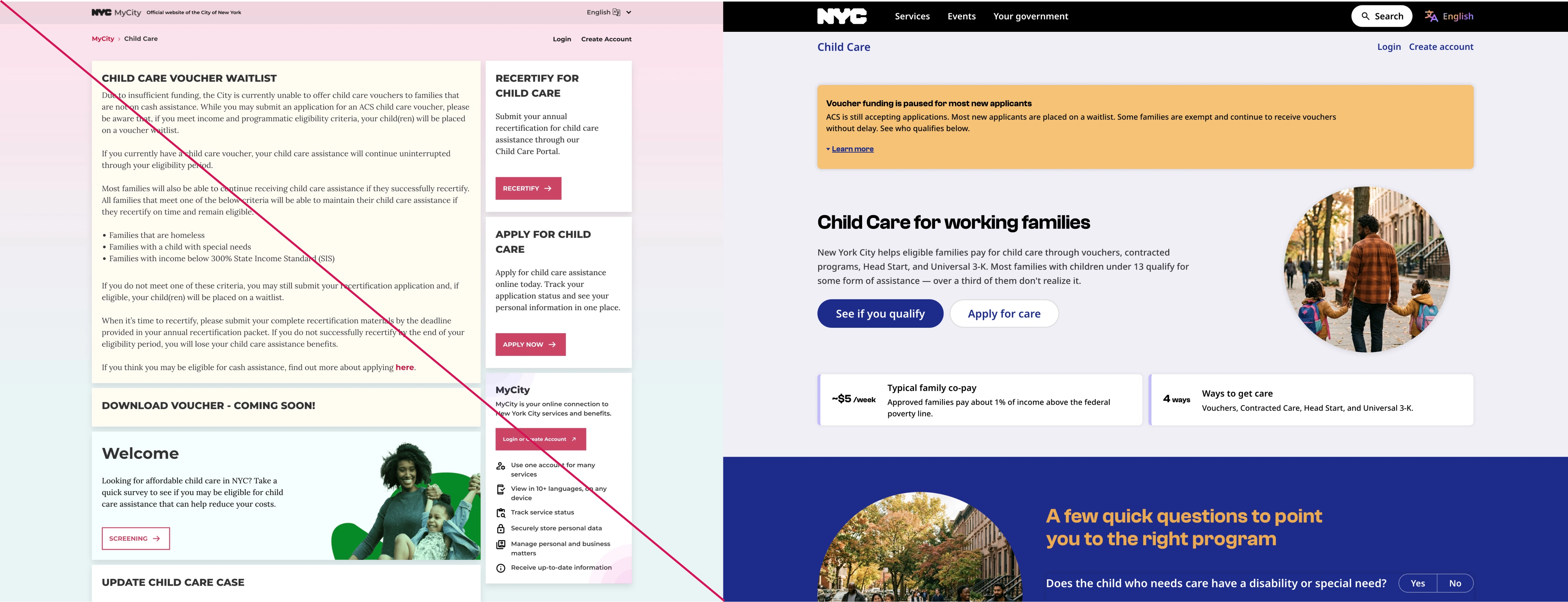
The audit
A close read of the live service followed the same path a parent would, screen by screen, noting each rough edge along with what would smooth it. The fixes took shape as the issues surfaced, so the findings arrived with a direction already attached. Taken together, they told a single story. The improvements that mattered most, a signed-in page that responds to your situation, progress that saves and resumes, application cards that let you act, kept running into the same wall: the platform underneath.
The question was no longer which screens to redraw. It was what the experience should stand on.
The decision
A picture of screens could describe a better experience. It could not be used, and a citizen could not test it. So the answer became something real: a functional, production-grade prototype of the service. It holds real state, runs behind a real login, and is covered by automated browser tests, and it behaves closely enough to the system it points toward that the team could trust what they saw. People could open it, move through it, and try it. It was meant to give the engineering team a running start too. The same components, structure, and copy could carry straight into the production rebuild, so that work would begin from something proven, saving time and cost on the way there.
Role
The Child Care portal was one piece of a larger engagement with New York City's Office of Technology and Innovation, and the need here was vocal enough that the stakeholders brought me back to it, with time set aside for this work. It came together in the space between design and engineering, carried end to end by one person, since the roles on either side were each focused on a single craft. That in-between, one person holding design and engineering together, has been the shape of work for clients across my career, recognized now under a name the industry has grown to use: Design Engineer.
You can open the working prototype and look around with the full set of controls:
live prototype, password teamoti@nyc
The groundwork
The decision to make something real raised the next question: build it how? The groundwork was imagined from the first sketch to do three jobs at once. It would show the fixes working. It would stand as a reference the production rebuild could follow. And it would be a safe instrument for testing open questions with real citizens. Every technical choice answered to those three jobs.
Why each piece
- One command to run it: a single command brings the whole gated prototype up locally, and another publishes it. A sync step runs first, so a developer always starts from the latest words. The loop stays short and easy to share.
- A single-page router: the journey spans many surfaces, the two-step check, a long application, the signed-in home, the pages that follow a decision, and a hash router moves between them with no reload and links straight to any one of them. Any state is a click away to review or test.
- One place for state: a single store holds who the person is, where they are in the application, and everything they have entered, saved in the browser so a draft survives a reload. This is what lets the home adapt to a person's situation, and lets someone return to the exact step they left.
- Design tokens: color, type, spacing, and motion held in one place, which is what lets two whole design languages swap live on the same screens.
- A shared component library: each part built once and reused everywhere, the same model the production rebuild would carry forward.
- A real gated login: Cloudflare Workers serve the prototype behind a genuine sign-in, and the passwords, the signing secret, and the keys live in environment files kept out of the code and out of version control. The gate is real, so the prototype stays securely accessible to the people chosen to test it, and no one else.
- Automated browser tests: the many states and the hardest flows are exercised in a real browser, and the same tooling captures each one, so the breadth keeps working as it grows and the states are quick to pull for review.

Words belong to people
Every line and every question lives in configuration as JSON, so the experience is shaped by config and a content owner can change a word without touching code. A small editor lets a content writer make a change and see it live, saved to a lightweight store on the edge and reconciled with engineering changes quietly in the background. The words a family reads can keep getting better without waiting on a release.
Proven before production
Building on the foundation the work pointed to brings a practical payoff. The speed and steadiness the audit flagged can be felt and judged now, well before any production commitment. And once testing settles the direction, the same prototype can be wired to live services, so the new experience can be measured against the current one on real data. The choice gets de-risked twice, once on how it feels and once on how it performs.
One source of truth
A functional prototype like this earns its keep beyond the screens. Between design, engineering, quality assurance, and product, a familiar gap tends to open. A flat design cannot carry interaction, state, edge cases, real words, or timing, so each group fills those blanks on its own, and every handoff stretches the loop a little longer. A prototype that already behaves like the real thing closes that gap, and for engineering it doubles as a reference implementation: a complete, functioning codebase that shows the intended behavior, something the production rebuild can be built against.
Shared by every team
- Engineering reads it as a working spec and weighs the foundation against it
- Quality assurance triggers any state or scenario directly to reproduce it
- Product and stakeholders feel a decision in their hands before committing
- Research, synthesis, recommendation, and proof live together in one place
Answers from real people
It also opens a door that is hard to reach in the design phase alone. By carving out specific flows and scenarios and opening each to a chosen group, the prototype gathers real answers from real people, the kind of evidence that is slow and costly to collect from static screens. Questions that would otherwise sit open get settled by watching the experience in use, with the data to back the call.
A shorter loop
Because the answer travels with the question, feedback lands on something real and testable. The finding, the fix, and a way to try it sit side by side, so the team spends less time aligning and more time deciding. That is the quiet value of the prototype: one place that design shapes, engineering reads, testing drives, and everyone can point to.

Is this for me?
On that groundwork sits the part a family actually feels, and it begins with the most human question of all: is this for me? The experience answers it gently, in two steps, before anyone has to commit to a long form.
A quick first check
Right on the landing page sit three short questions, each with a plain note on why it is being asked. One mentions that a child's disability can raise the age limit. Another notes that care at night or on weekends points toward particular programs. The check teaches a little as it goes, and the button that follows reads "Continue to the full check," because nothing has been decided yet.
The fuller picture
The full check picks up exactly where the quick one ended. It carries those first answers forward and fills them in, and it says so in a calm, plain note, since this is only a recap. It asks about household size and income against real limits, set as a share of state median income and shown live as the household size changes, along with the child's age and the reason care is needed.
A recommendation you can set aside
With those answers in hand, the experience points to the program that fits and explains why, while making it clear the choice still belongs to the family. The suggested program is marked, next to a plain line that another program may also be open to them, with a side-by-side view for anyone who wants to compare. When one path does not fit, the screen names the reason and offers the options that do. From there a single sign-in carries the person into the application, with their profile and any documents they have already shared filled in, so they only enter what is new.
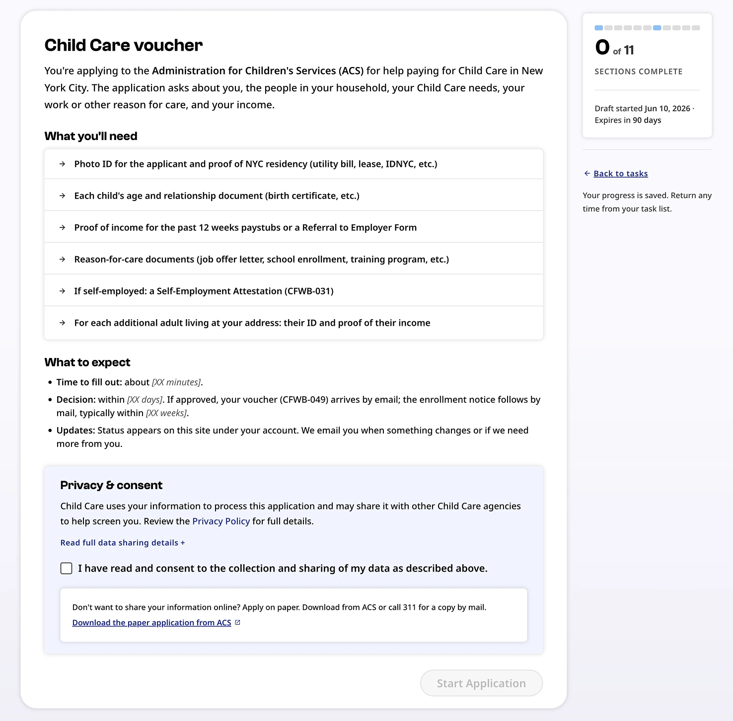
A form that fits
A long application does not have to feel long. Most steps ask a set of related questions together, plain and readable, and a person moves through them in one pass. The care goes to the moments where real life is more tangled than a form expects, and to the small considerate moves that lower the stakes along the way.
Knowing what to expect
The application opens by laying out the road ahead in plain words: what it covers, what to have ready (identification, proof of where you live, proof of income, the documents that explain the reason for care), roughly how long it takes, when a decision arrives, and how long a draft is kept if life gets in the way. Consent sits at the end, short and clear, and Save and exit stays within reach throughout, so stepping away never costs the work already done.
It already knows you
The application starts from what the city already holds. Name, address, and contact details arrive as filled-in cards a person confirms, with a single link to change them. When a child has been entered before, their details can be pulled from the profile and carried in, marked as reused, so a family only types what is genuinely new.
Looking out for you
The form pays attention to a family's answers and speaks up in the moment. Say your housing is temporary, or that you receive Cash Assistance, and a quiet line tells you this skips the waitlist. Where a choice could cost a family that standing, a gentle caution flags it before they pick. And when an answer means more work later, the form says so on the spot: note that pay varies, and it explains the city will ask for twelve recent paystubs, where steady pay needs four. Each of these arrives at the moment of the choice, while it can still shape the decision.
One thing at a time
The parts that hold people, the children who need care, the others in the household, each job, are added one at a time. An entry is filled in, lands as a short summary line with a quiet saved cue, and the next is added only if it is needed. Follow-up questions appear only when they apply and clear themselves when the answer changes, and an error never shows until a person has had a turn to answer.
Documents in their place
Documents are gathered in their own steps, so the questions stay about a family's life and the proof comes afterward. Uploading happens inline, a file at a time, and a person can choose to keep a document in their account so the next City service does not ask for it again. One of those steps, proving income, is involved enough to deserve its own treatment.
In plain language
The words try to meet people where they are. Long rules are lifted out of dense paragraphs into short, scannable notes, unfamiliar form codes are explained where they appear, and the experience speaks more than one language, with a path to reach a person by phone in many more, so a family is never left out for the language they speak.
The hardest part
One stretch of the journey carries more weight than the rest: proving income. It is where an automated read of uploaded pay documents meets the untidy reality of how people are actually paid. This is the part built as a full vertical slice, a complete cut through every layer from the screen down to the logic, because it is where a one-size flow tends to let people down.
Where pay gets messy
Real pay is rarely tidy. Hours change, amounts vary, a document is older than expected, a read times out, a second job pays on a different cycle. The prototype models these as scenarios anyone on the team can trigger on demand, each showing the result a person would see for every employer, with a clear way to put it right.
Designing the hard cases on purpose
Because the difficult moments are reproducible, they can be designed with care and tested with real people, long before they would ever surface in production. The point of the deep slice is to make the worst day on the form a designed experience, one that holds steady when a family needs it to.
Coming back to it
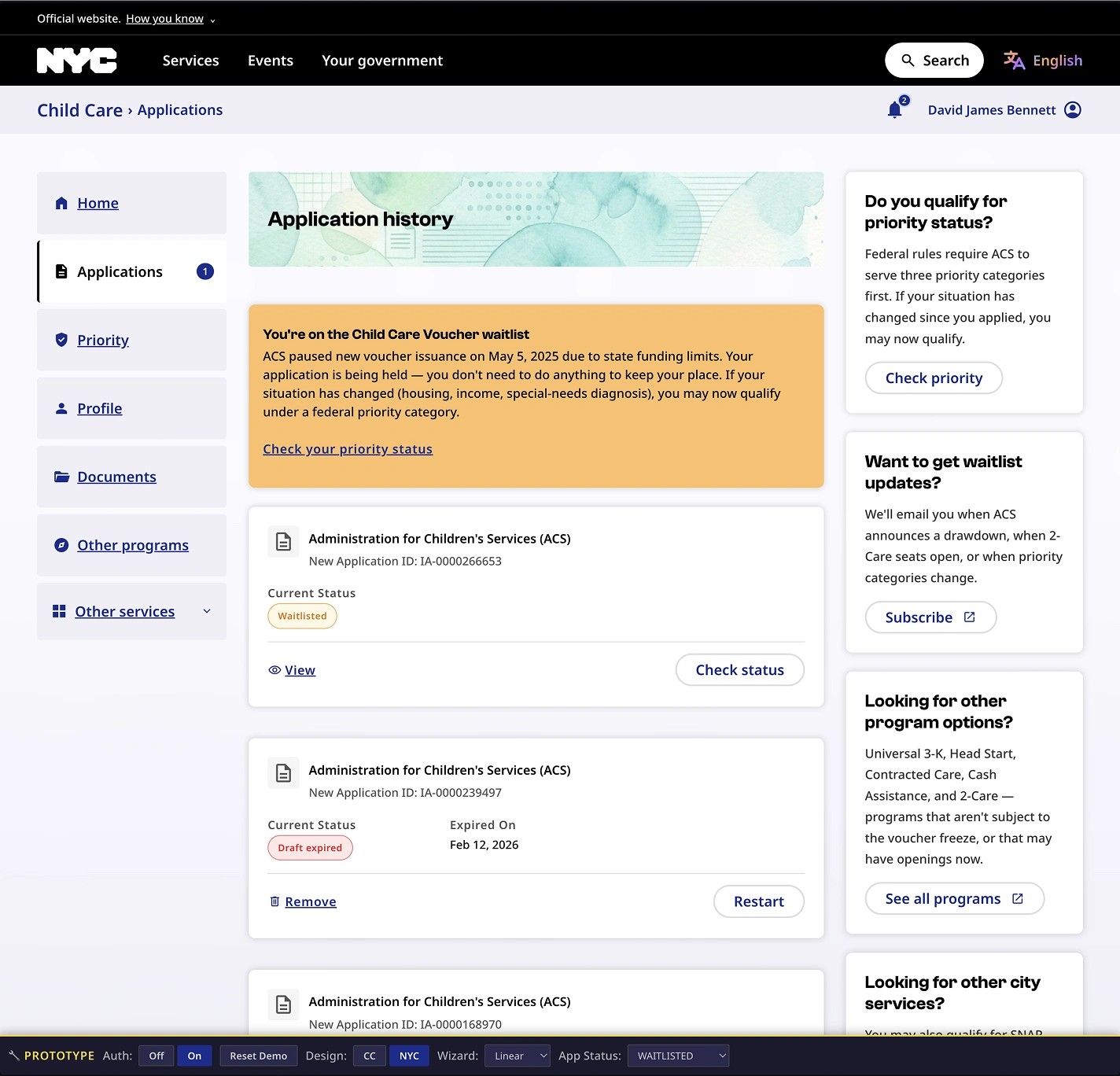
Few families finish in one sitting. So the signed-in home is built around return. After signing in, a person lands on Home, called Home because that is what it is, the place a family comes back to.
A page for your moment
What sits on Home depends on where a person is. Someone just arriving is invited to check eligibility and begin. Someone mid-draft sees their progress and a clear way back into the exact step they left. Someone who has submitted sees what happens next, and by when. Someone with a decision sees what it means and the one action that now fits, whether that is downloading a voucher, recertifying, checking a place on a waitlist, or looking at other options.
Back to where you left
Returning to a draft brings a person to the step they were on, with their answers intact. The work waits for them. A small thing, and often the difference between finishing and giving up.
Navigation that follows you
The menu shifts with the same logic, showing the routes that match the moment and resting the ones that do not.
Letting people decide
One open question sits under the whole redesign: should the experience refine the look it has, or take on the city's public design system, so every service starts to feel like part of one place? The working prototype turns that question into something citizens can answer.
Two languages side by side
The same journey is dressed in both design languages, and in both ways of moving through it, a guided step-by-step path and a freely ordered task list for people who like to choose where to begin. One of those languages is New York City's public design system, an open, shared toolkit meant to give every city service a common look and feel. A built-in set of controls can place a given tester at a chosen starting point, in a chosen language, on a chosen flow.
Targeted and safe feedback
Each tester sees a realistic experience built entirely on made-up data, behind a genuine login. So one group can live in the public design system on a task list, while another lives in the refined current design on a guided flow, and the feedback that comes back is focused and comparable. Because nothing real is ever exposed, it is safe to gather.
One feel for the whole city
The bigger prize sits past this one service. A shared design language means the next service, and the one after, can feel like part of the same city, familiar before a resident has read a word.
Try both sides
The clearest way to understand the choice is to feel both sides of it.
| What you'll see | Link | Password |
|---|---|---|
| The public NYC design system, on a freely ordered task list | Live prototype | testerNYC |
| The refined current design, on a guided step-by-step flow | testerCC | |
| The Child Care service families use today | Current service | |
What you will see is a starting point, two directions made real enough to test. The point of putting it in front of citizens is to learn where families still struggle, and to grow it from there.
The path forward
What stands today is a working prototype that answers the audit, and a way to choose what comes next with evidence in hand. The open calls, which design language to carry forward, how a family should move through a long application, where to invest next, can be settled by watching real people use it.
A starting point
What these links show is a starting point: the journey made real through two design directions, New York City's public design system and an improved version of today's experience. The deeper work begins once families start using it. Watching where people still pause or struggle is what shows where to evolve, enhance, and keep refining, and the team carrying this forward is well placed to do exactly that.
Handing it on
My contract concluded once this work was delivered. By then the teams had aligned around the prototype as a shared, trusted reference, with clear agreement that it was a valuable way forward, which felt like the right point to hand it on. The initiative is in good hands, and the team will test it with citizens and carry it further.
A way of working
A working prototype like this says less about one service and more about a way of working. When design and engineering sit in the same hands, an idea can be seen, tried, and decided on with little distance in between, and a team moves with more certainty. This portal is one of many examples of that, and the reason teams find the approach worth reaching for.
